AlongHealth is a six-month long project, where we created a website, web-app and iOS app for a startup offering digital remote patient monitoring.
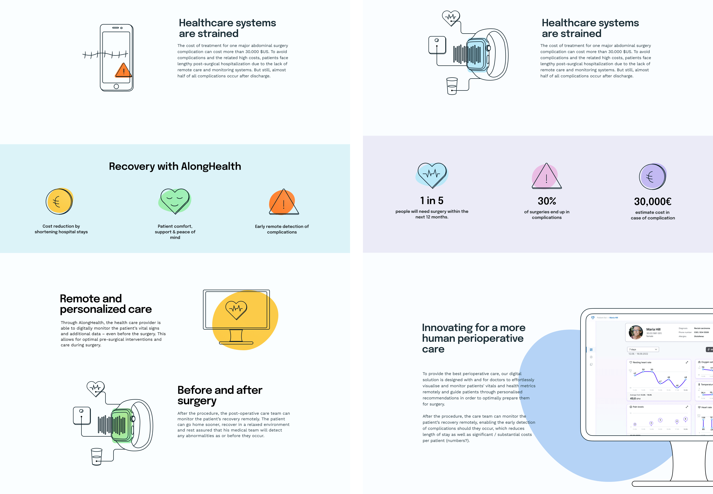
AlongHealth is a digital health platform that enables medical staff to accompany patients before, during and after surgical procedures. Through the use of wearables, they create an optimal preparation for medical intervention, as well as a safe aftercare in the home environment.
Amandine Boisseaux (UX & UI Lead), Macarena Herreros (UX Design & Research) and I (UX & UI Design) joined the startup for a period of six months.
Within the first couple of weeks, the startup need a corporate identity and functioning website, in order to start presenting their idea on conferences. I created a design and developed the website. At the end of the project, I added the updated corporate colours and mock ups to the existing website.
The main goal for the six months was to design and prototype MVPs of a web-app for doctors and native iOS app for patients.
As the first use case, AlongHealth wanted to specialise on patients with rectal or colon cancer, who would need to receive a stoma.
The core features would be:


The first step in our design process was to understand the problem. Our research included reading a number of medical articles and papers to understand what’s already being done to monitor patients remotely after surgery and what kind of wearables are used for this and how, the types of complications that occur after discharge and how often they occur. The next step was carrying out a competitor analysis, in which we analysed six competitors.
As our strengths, we deduced the interoperability, being highly specialised and having a wound tracking feature. The threats lay in competitors becoming interoperable and not gaining the support of doctors or the trust of patients.
We conducted a survey amongst physicians of different areas to understand if they would use the app, how often they would check on their patients, what parameters they considered important and what symptoms they would want to track.

95% of the participants said they would use a platform like AlongHealth.
I then designed a mid-fidelity prototype for the patient list, dashboard, patient info and files.

With the finished prototype, we carried out usability tests with seven physicians. The grand majority had favourable opinions of the offered solution. However, there were a number of wishes and suggestions that we realised would highly benefit our product, and I was able to implement a few improvements in the design.
We decided to add a note feature, a history for the sent recommendations and side-by-side display of wound pictures.
While the others switched to the research for the iOS app, I started working on the final designs.
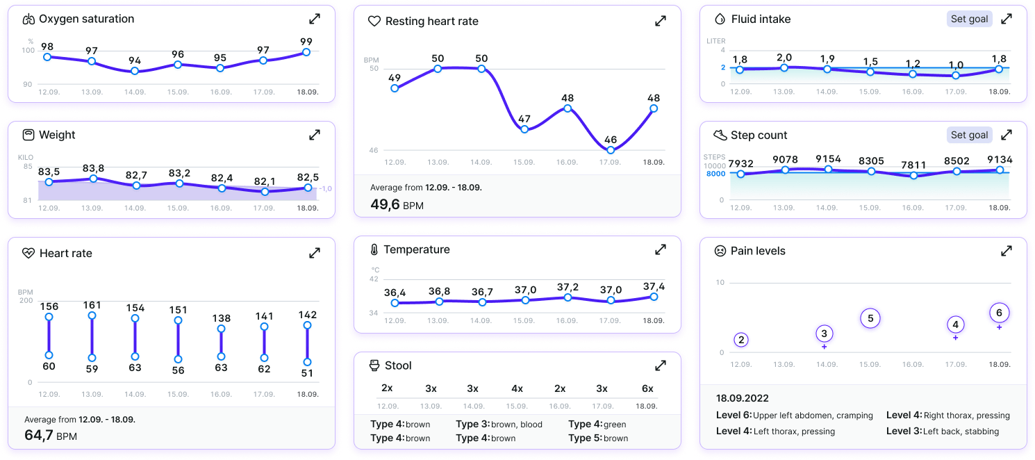
The hardest task was to implement the different ways to visualise vital parameters. It took me a long time and several feedback rounds with the physician in the team to land on a colour and size combination which illuminates the content accordingly.
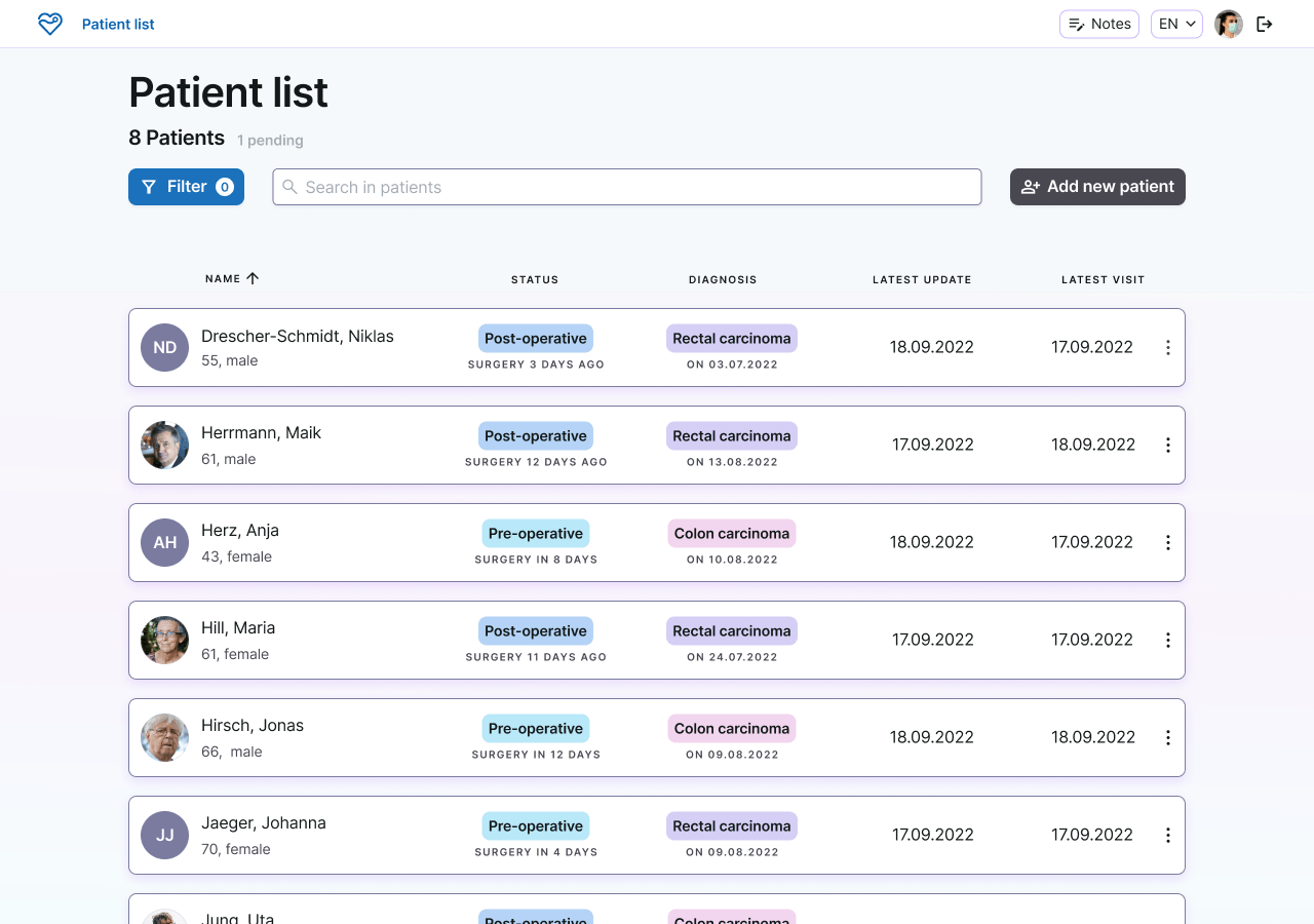
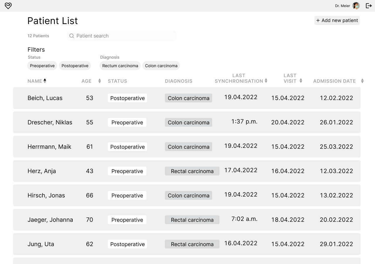
Patient List
This is the landing page after the doctor has logged into the web-app and where they can access all their patients. The patient list offers the possibility to filter patients by operative status and by diagnosis, as well as a patient search. Relevant information for each patient is shown, such as the last physician visit and last time the patient sent an update.
New patients can be added here.
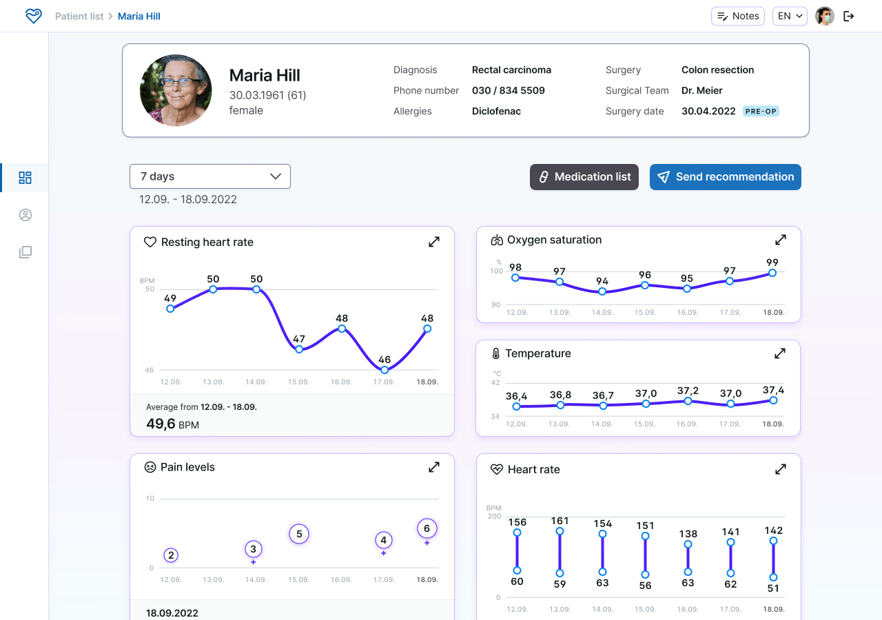
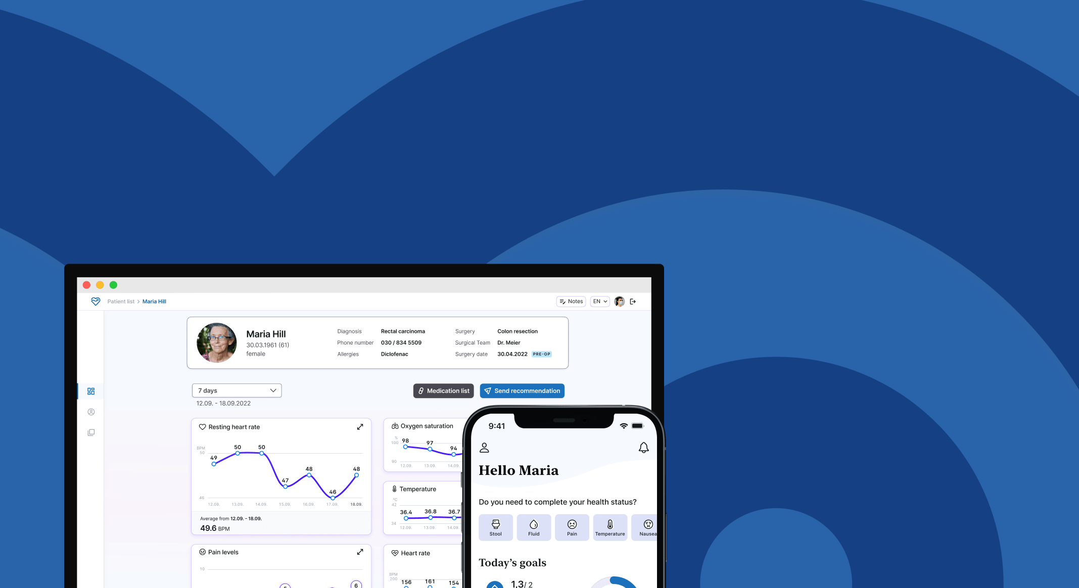
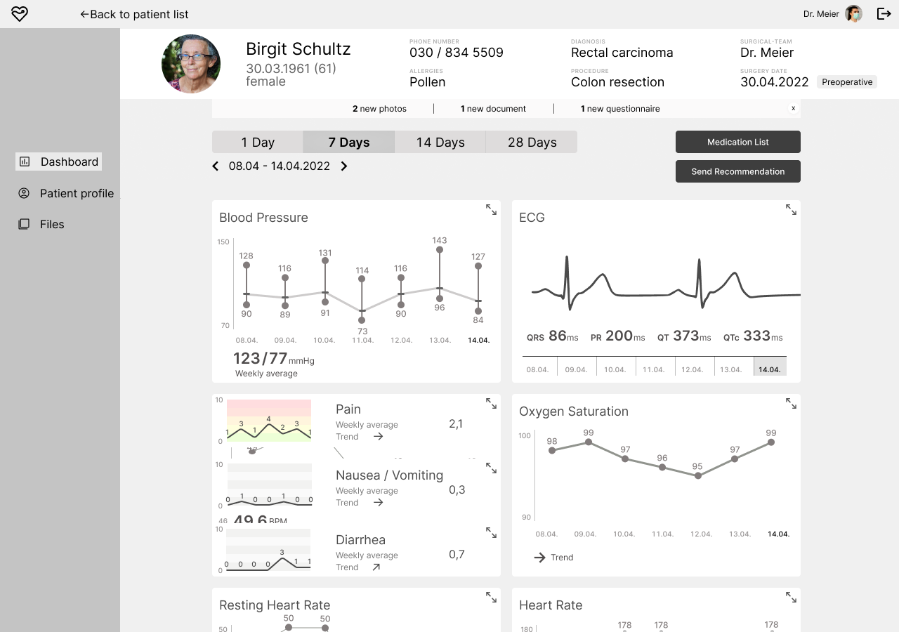
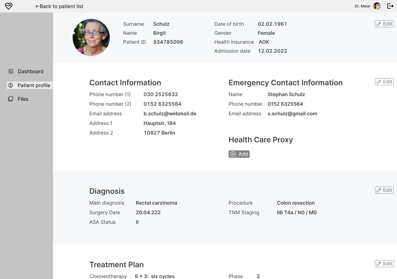
Dashboard
A modular dashboard where doctors can see each parameter individually, or are able to view parameters combined in order to compare them. Patient input, such as water intake, step count, temperature as well as symptoms, can be tracked. The medication list of the patient is accessible through the dashboard. When the doctor notices room for improvement, they can send recommendations to the patient through a modal found in the dashboard. According to the feedback from the usability testings, the selectable time frames are 3, 7, 14 or 28 days.
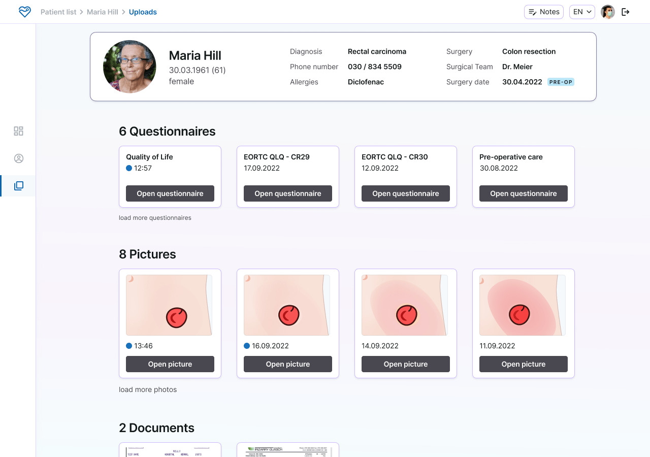
Files
The physician can access uploaded photographs of the patients’ surgical wounds and stomas, so they can remotely observe the recovery. Filled questionnaires will be uploaded to the files.
Because of the strict time constraint, not all of the planned content from the mid-fidelity prototype could be designed.
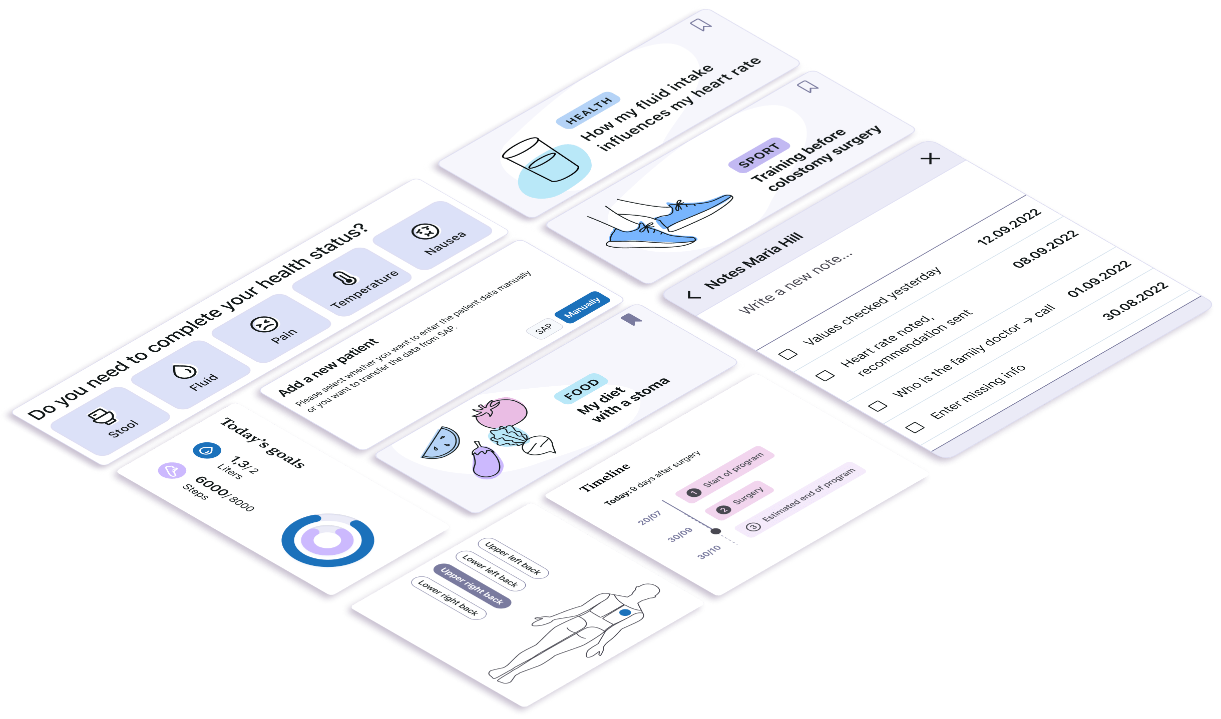
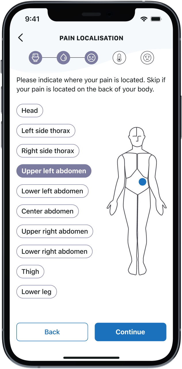
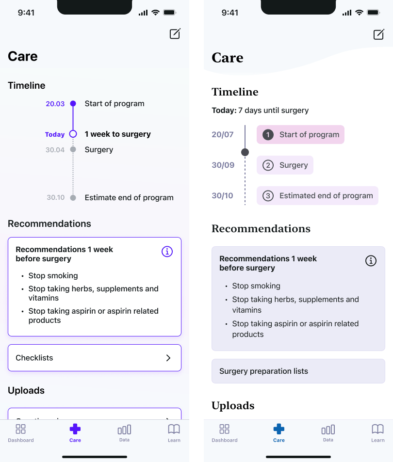
The focus of the app was to allow the users to upload the data from their wearables, enter annual data, see recommendations from the physician, see a confirmation, that their data has been checked and upload pictures of their stoma. All these functions should be found within the main tab.
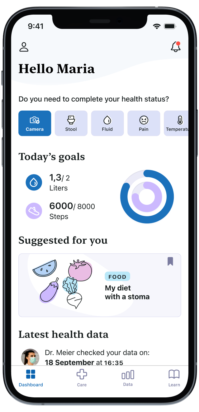
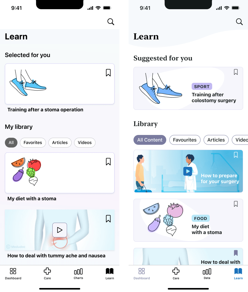
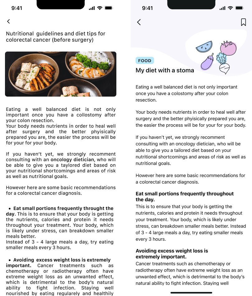
Additionally, the app includes features like a visualised timeline of their patient journey, preparation checklists, statistics and explanatory articles.
Due to the time constraints, there were unfortunately no usability tests for the app. I joined working on the app towards the end of the project, so my role was to work on the details of the layout and typography. Some of my redesigned screens are displayed below.
Because of the time constraint, I would regard the designs in this project as not quite finished yet and more of a starting point to display the core features for a first product launch, which would then need to incorporate feedback from user testing.