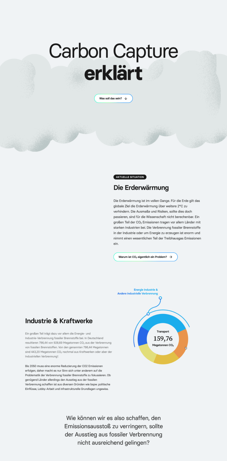
Global warming is in full swing. Carbon Capture and Storage (CCS) as well as Carbon Dioxide Removal (CDR) technologies offer potential solutions to reduce emission if an exit from fossil combustion is not sufficient. But how do these technologies work?
The goal of the project was to develop interactive infographics that inform and educate about various aspects of climate change.
During the project, we worked closely with collaborators from the SENSES project, which developed modules to help understand and communicate climate change scenarios.
In order to explain something, it is necessary to understand it first. Therefore, we started the project with a lot of research and held discussions about categorizing the knowledge.
Our goal was to build a website, explaining the technologies in a descriptive and comprehensible way.
While still researching, we started with the first designs. We often had to discard ideas because newly acquired information required a different editing or layout.
Nevertheless, the additional visual approach helped in structuring and understanding the technologies and relationships between them.
During this phase, I realized that it was important not to get too distracted by new, perhaps more exciting facts and design ideas if they didn't relate to the original topic. My role in the group during this time was very pragmatically oriented towards the goal, which allowed me to guide and focus the others in the team well.
During this phase, I realized that it was important not to get too distracted by new, perhaps more exciting facts and design ideas if they didn't relate to the original topic. My role in the group during this time was very pragmatically oriented towards the goal, which allowed me to guide and focus the others in the team well.
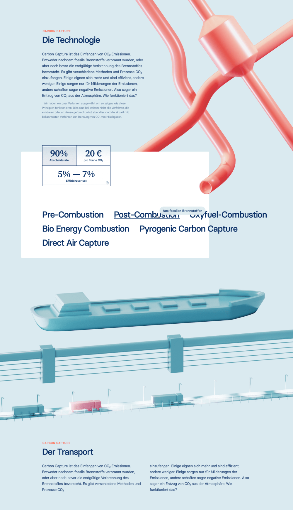
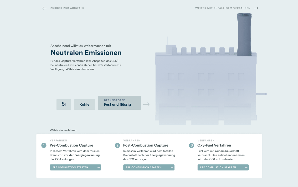
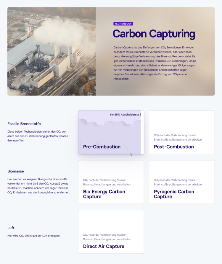
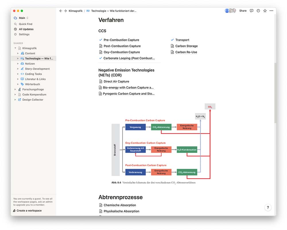
After the first rough organizing of the technologies, the whole complexity of the topic became clear to us. We reduced and structured the various technologies into six main categories, which would make up the core of the website.
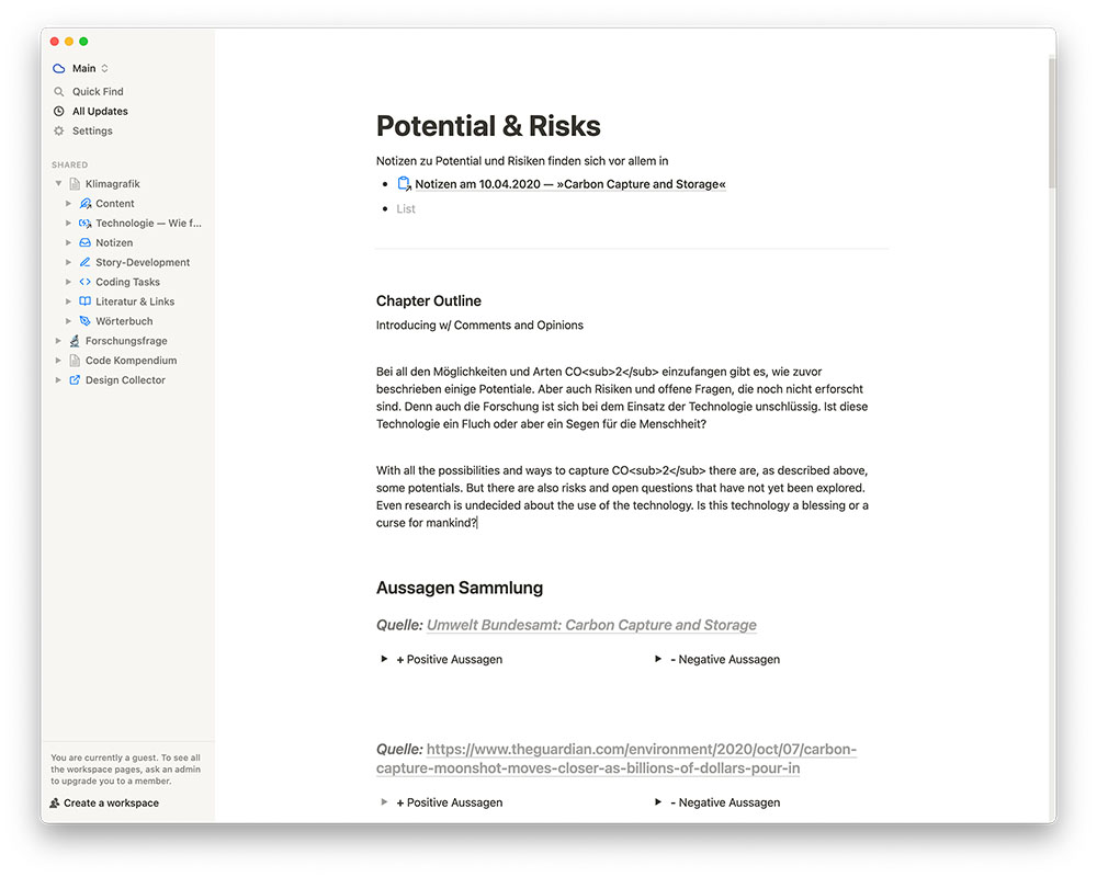
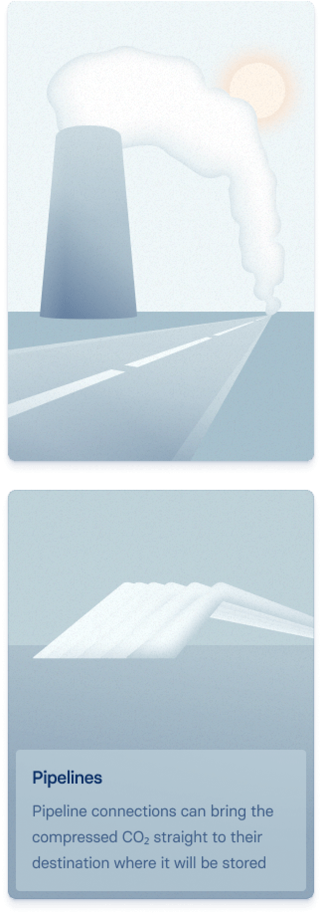
Furthermore, there would be an introduction to the relevance of the topic and an introduction to the subjects of transport, storage, or reuse from CO₂ as well as a place for critical and favorable voices from the scientific community.


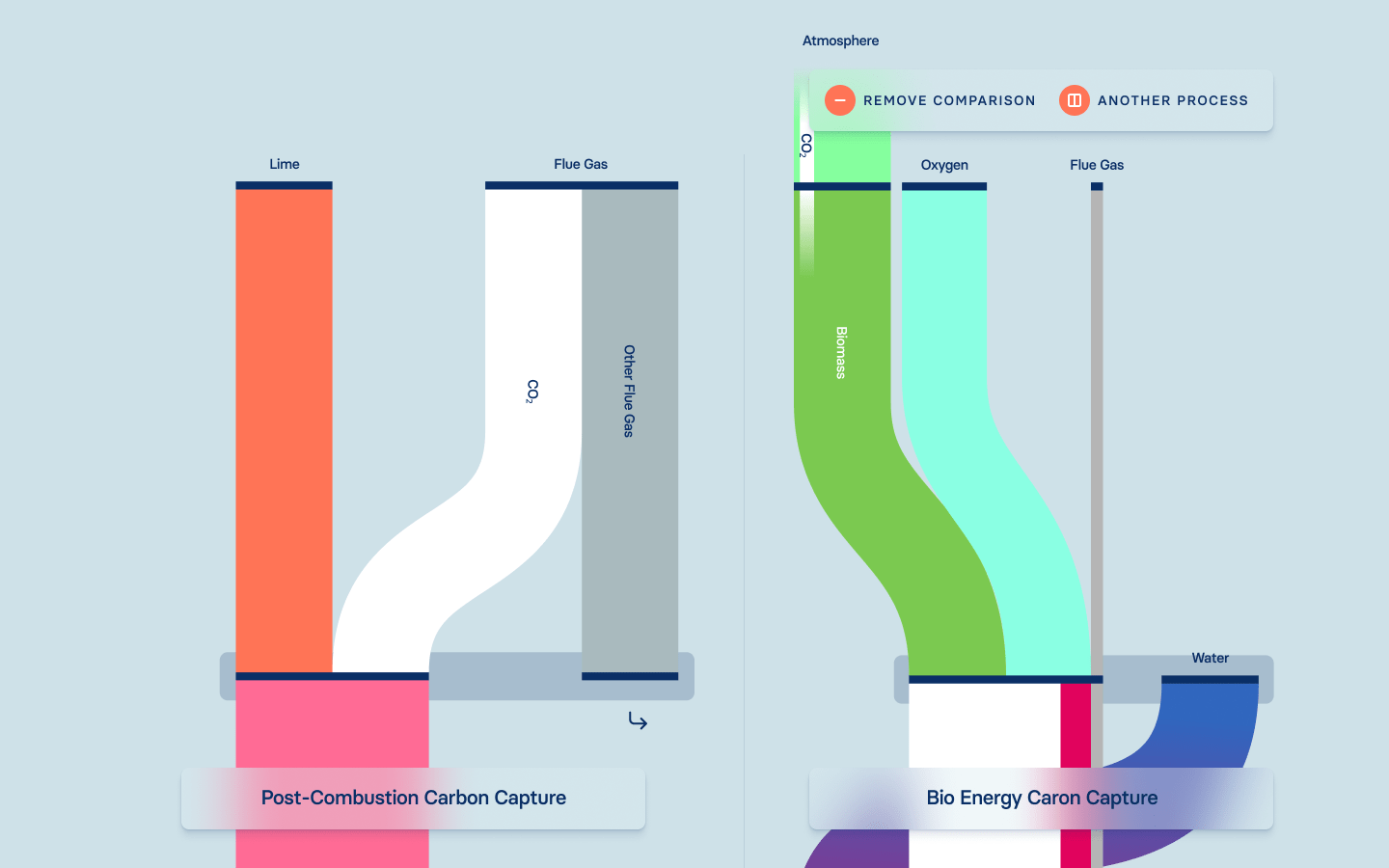
Of particular importance was the clear design of the core of our topic:

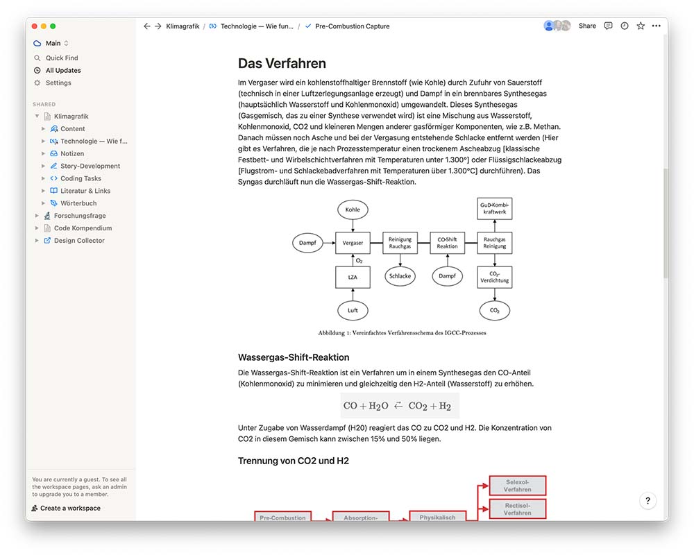
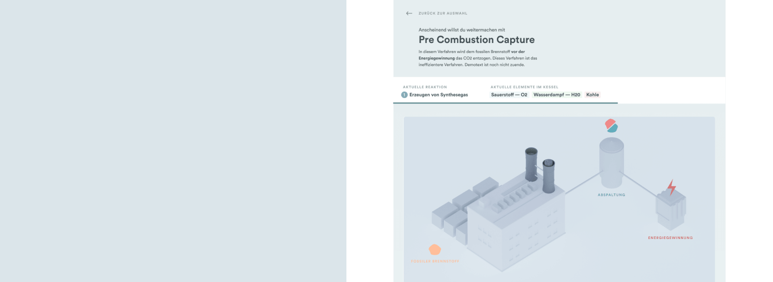
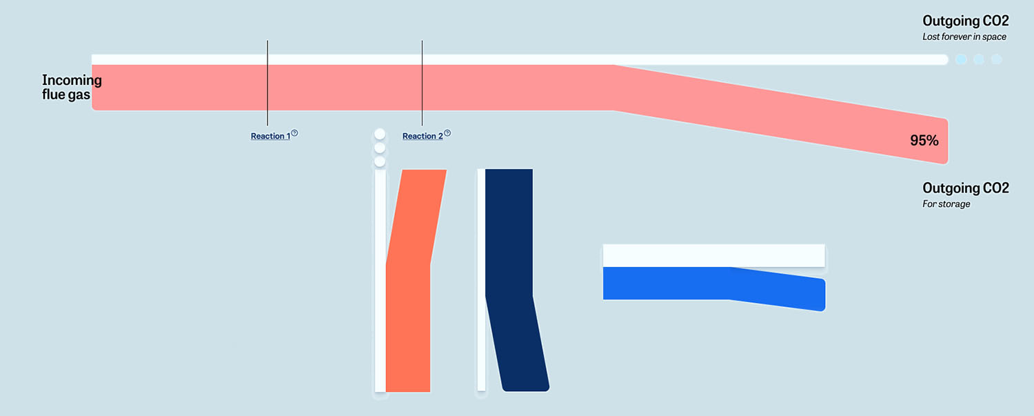
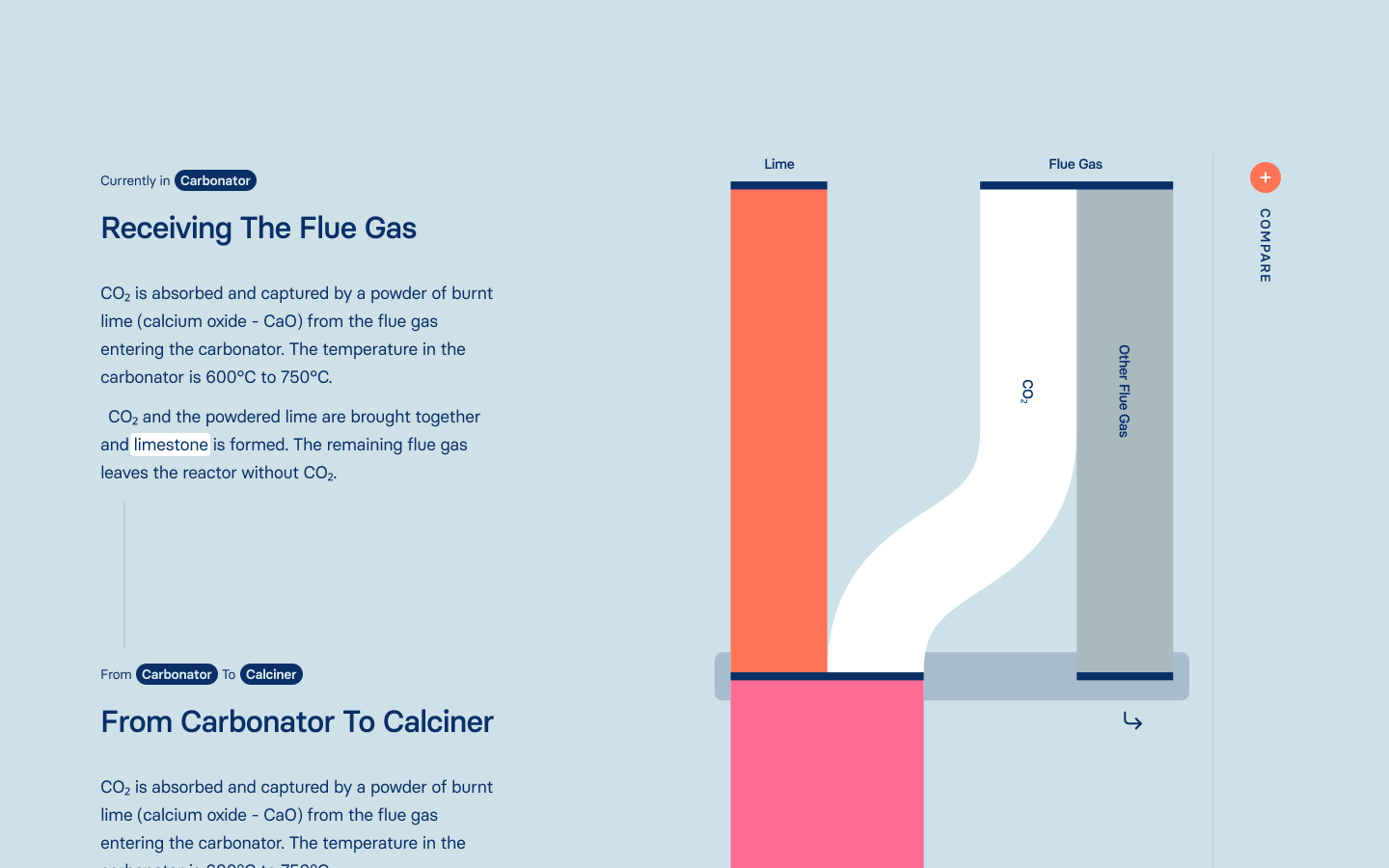
Here we decided on a presentation visually based on Sankey diagrams. A sequence is shown in which the individual components can be followed as they change during chemical or physical reactions. CO₂ is always visualized in white, allowing the viewer to recognize and follow its course throughout the process.
While the others started coding the website, I stayed on the research and designed the diagrams for all remaining technologies.

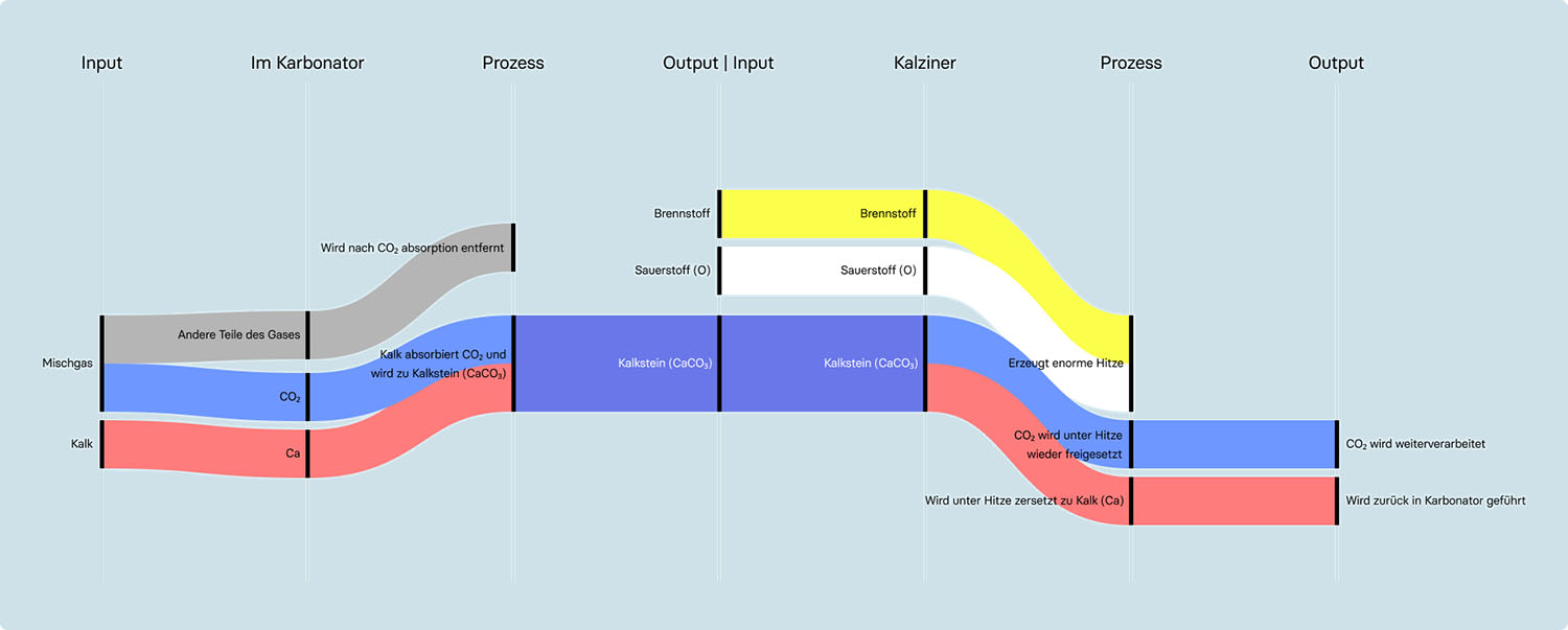

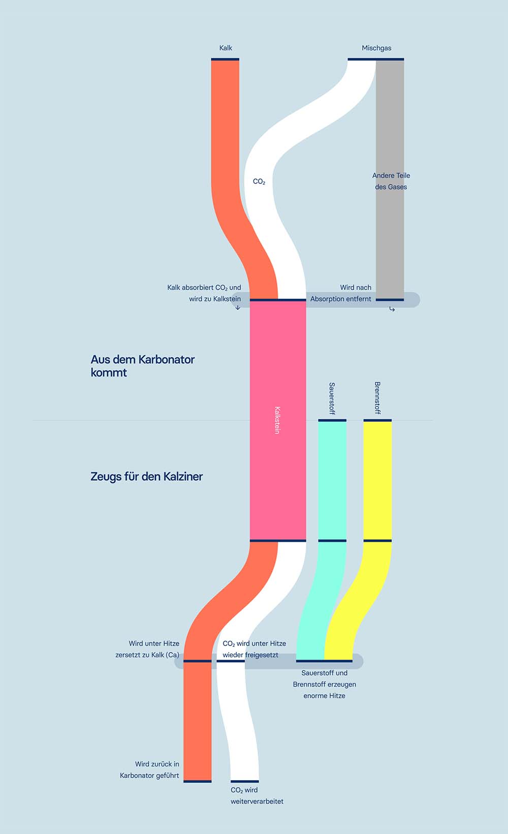
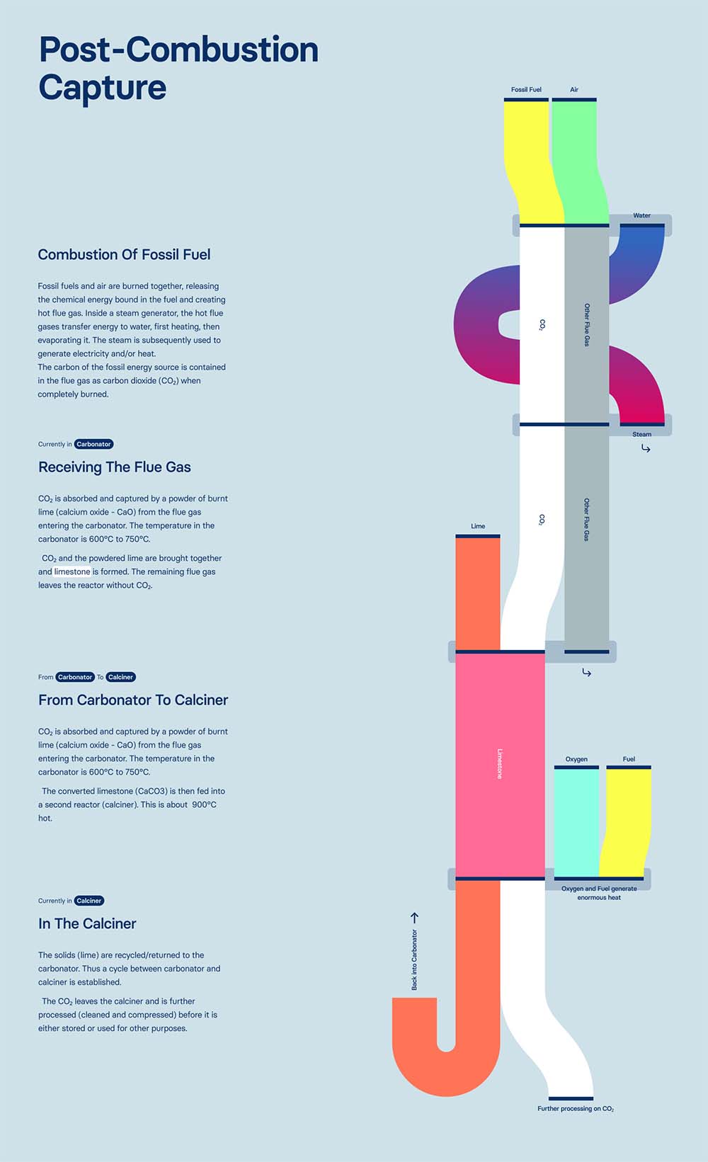


The decision to use an adaption of the Sankey diagram ultimately had an impact on the rest of the design. The one-dimensionality of the diagrams required that the remaining designs, which we had previously tested in a three-dimensional style, were adapted and simplified.
The color palette of the individual elements represented in the processes eventually determined the colors for the other elements of the website.


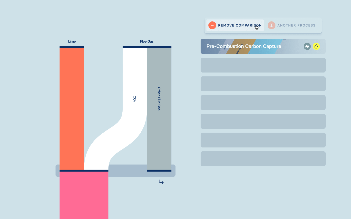
A linear scrolling leads through the website, which only breaks out to explain the specific technologies and allowing a side-by-side comparison.
During the iterative process, the main focus was on which visual representations fit together. We also realized that we wanted too much – too much information, too many visuals. We had to reduce that noticeably.
The website already contains a lot of complex information, which is why it was important for the design to include only the most necessary information for the understanding of the topic and to visualize it accordingly (and appealingly).