Periodeux is an iOS App that offers a modern take on period tracking: non-stereotypical appearance, simple to use, user-centered functions & total data privacy.
The idea for this project emerged from personal frustrations over the status quo of other period tracking apps.
Analyzing the visual appearance of such apps a clear trend towards clichéd elements for »female-topics« – like flowers, feathers, or the color pink – are predominant.
Our observations further left the impression that some of these apps are constructed in an impractical way, where main functions are hidden behind navigation elements. An overflow of functions – in one example a chat forum – often distracts from the main function of the period tracker.
During our first iterations we focused on the contents of the app:


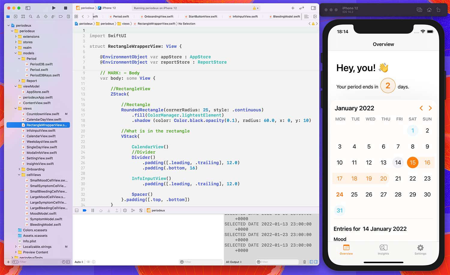
We decided, that when opening the app, the user lands on the overview tab where the most central information is portrayed through a counter: respectively when will the period start or how long will it yet last.

Periodeux is concentrated around functions that are user-centered and suitable for their purpose.
The calendar that is placed underneath the counter contextualizes the information by showing the current date, the estimated ovulation date as well as upcoming and previous cycles.
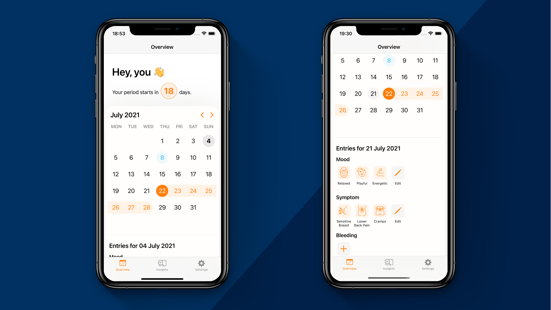
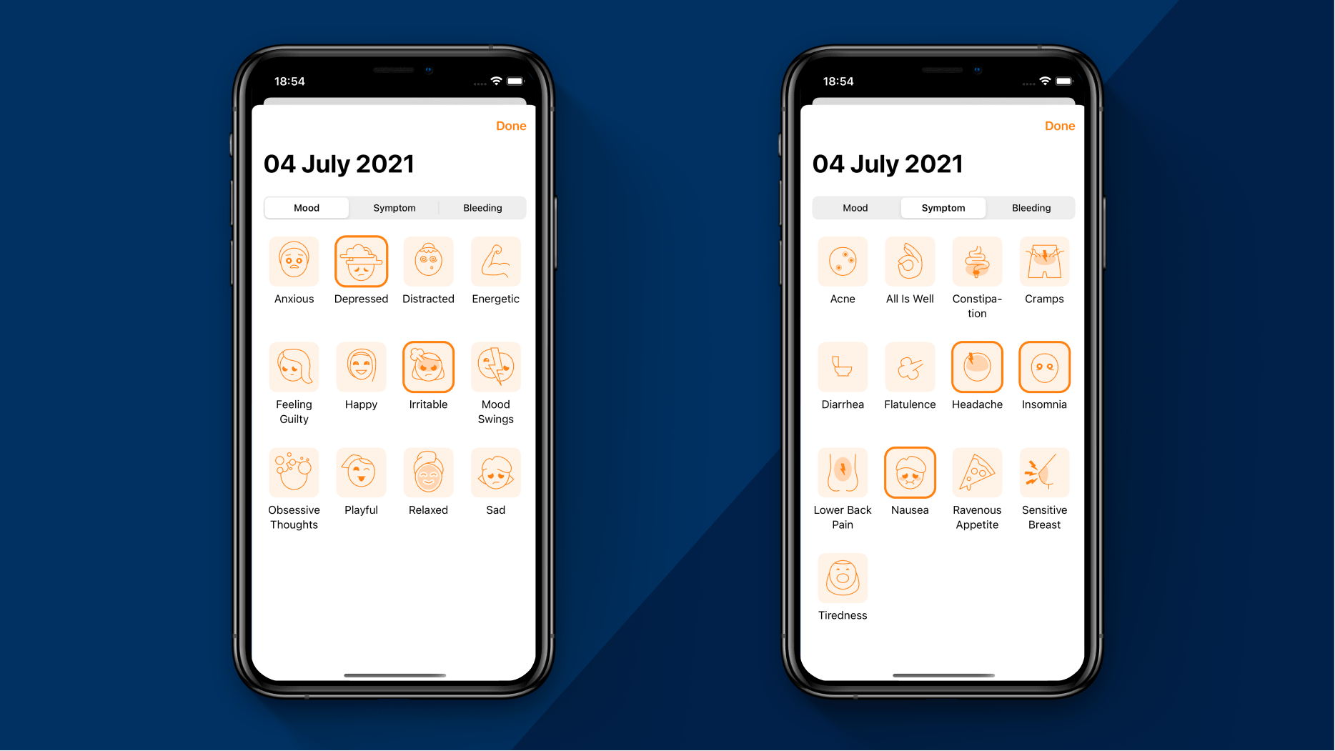
Within the calendar, users can document moods, symptoms, and bleeding strength through tapping on a date and choosing from a sheet view that opens up when editing the entries underneath.
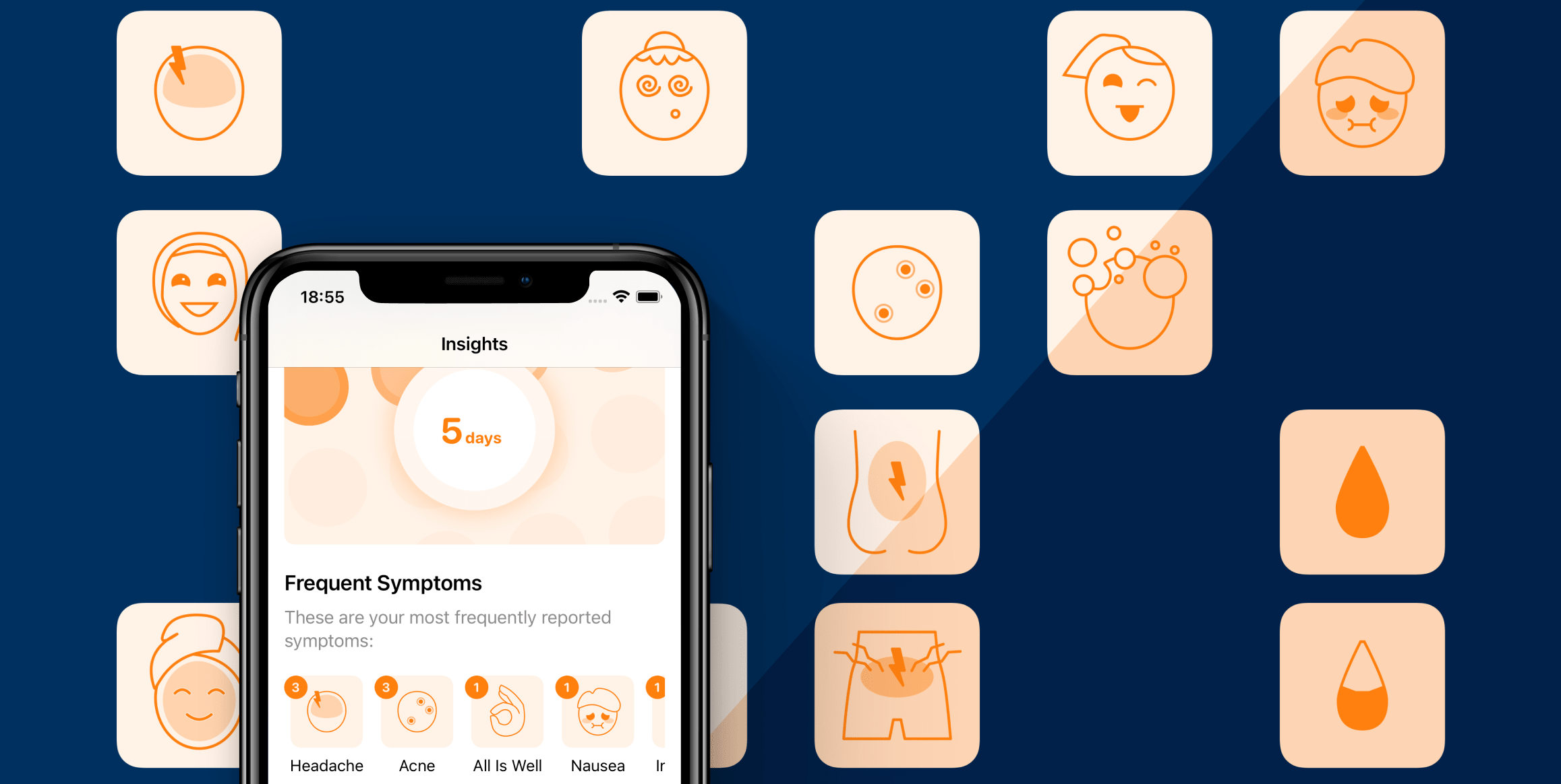
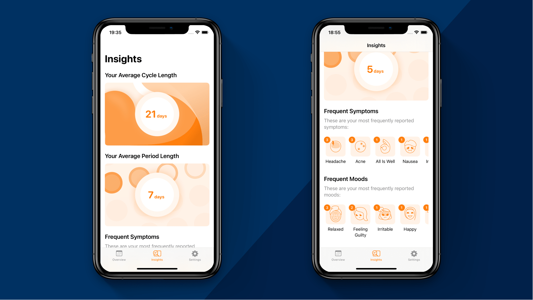
Next to these main functions, users can find useful insights that are generated from using the app. The app shows the average cycle and period length, frequent symptoms, and moods.
In the next step we focused on finding a visual language that moves Periodeux away from stereotypical »female« elements, with orange as an unbiased highlight color. To us, it was important to give the app an appearance that takes the topic seriously with a realistic and overall positive tone.
We designed icons that portrait a diverse and inclusive user group to make Periodeux a comfortable place for all menstruating people, with a representation of symptoms that is closer to reality.
For the app icon, we used elements that refer to the actual interface or hint at the topic. It is a combination of one of the mood icons, the calendar highlights and a cycle icon. The mood icon we used for the app icon is the »playful« icon, which carries an overall positive vibe to pass onto the users.
Periodeux is programmed with SwiftUI. We started the project with quick prototypes in Figma, but as our skills in SwiftUI grew— well, swiftly, we realized that preliminary sketching wasn’t useful for basic screens, since realizing them in SwiftUI was just as fast and resulted in working code. More complex screens and new features where tested in lo-fi prototypes before programming, enabling us to structure problems and respective solutions.
All the data that will be generated while using the app is stored locally on the user’s device. We avoided using cloud solutions to provide high data safety to let the users be comfortable with documenting detailed personal information inside our app.